The Unemployment Report, also referred to as the Non-Farm Payroll (NFP) Reports, is a major indicator of a country's economic health, and one of the most anticipated economic reports for investors in all markets, including the Forex. This report, in the United States, includes roughly 80% of the paid workers in the country and excludes government, farm, and non-profit employees and is released on the first Friday of every month by the U.S Bureau of Labor Statistics
The Unemployment/Non-Farm Payroll Report is one of the major five economic reports for each country that traders jump on, the other four being interest rates, consumer price index, trade balance, and retail sales.
Even among all these, the unemployment report often gets the strongest attention, and is considered one of the most accurate economic indicators of a country's overall economic health, which makes sense. The more people who are working, the more currency you have being made and spent in a nation's economy.
Should You Trade on the Non Farm Payroll Report?
The short answer is: "Not unless you know what you're doing."
The Non Farm Payroll Report is often seen by new traders in the forex markets as a juicy profit opportunity. But, is it really as easy a call as some would have you believe?
The problem with attempting to trade on this report is that the hour when this announcement is made is one of the most volatile periods during the month; therefore it can be susceptible to big surprises in market movement.
When asking yourself the question: "How do I trade the Non Farm Payroll Report?" The answer you should be heeding (if you're new to forex trading) is: "You don't." Or to put it another way, "By maintaining a neutral position."
The market is far too volatile during this time to expect a high probability trade. There may be some gamblers who relish the thought of "placing a bet" to go long or short, expecting to make a small fortune for a few minutes work. But many serious traders know better and prefer to remain on the side of caution. The majority of them say the same thing: "Stay on the sidelines and wait for the market to calm down." This may take between 30 to 45 minutes in some cases, and even then the direction of the market may still be uncertain.
Of course, if you are an experienced trader using price and volume indicators you may have an easier time during these volatile trading periods. Your trading time may be all of about a half a minute or so. But trading within these windows of opportunity a small fortune can be made if you get in and get out at just the right moments. And, as mentioned before, if you truly understand what you are doing.
So how do the savvy traders manage during this magical time? The same way ALL trading should be done . . . plain and simple. You do what the market tells you to do via price and volume. There is no secret and no chart or no news report that can predict the future, especially when trading in these short time intervals.
No matter what you read or believe, the market will do what it wants.
The Non Farm Payroll announcement is just like any of the other volatile government announcements: you wait for the price to move. It either goes up really fast and pauses, retracing slightly, or it goes down really fast and pauses, then retraces. It has followed this pattern every single time this phenomenon has occurred. You simply watch the tape and when the opposite side of the move starts to be taken out in bug chunks you get ready to jump in. You can miss it by a tick or two and not suffer any ill effects from having done so.
On the other side of this question, there are many who believe that the Non Farm Payroll report can set the tone – creating a trend – for the rest of the month. If this is true, it means that a trader would not have to trade the report in the short term with all the accompanying risks. Instead, a trader could open up a longer term trade late on Friday, Sunday, or Monday – when the trading environment is calmer – and hold onto the trade for days or even weeks. These trades could have the potential for gains of 100 pips or more.
Whichever way you choose to go, be certain of the strategy you use and of your ability to accomplish the trade you intend to make. Forex trading on the short term is often not something that new traders should necessary expect to be able to successfully achieve. When contemplating a trade in a volatile market, just be careful and don't try something you're not one hundred percent certain of.
In the development of your forex strategy do you wonder how you can trade the non-farm payroll report?
Seeing this is one of the most, if not the most, volatile announcement during the month (first Friday in every month) newer traders watch the huge movements and wonder how to make money from all that volatility.
The answer given below you may not fully appreciate until some explanation is offered.
Question
"How do I trade the non-farm payroll report?"
Answer
"You DON'T!"
Or to put it another way, "By maintaining a neutral position!"
Some suggest you can trade volatile market movers such as the non-farm payroll report by waiting for the first leg of the move, up or down, then wait for price to pull back 10 or 15 pips, then enter a trade to catch the second leg of the move which often follows.
That's one possibility but still high risk..
Trading The Aftermath
However, while many professional traders sit out the non-farm payroll report, that doesn't mean they don't trade afterward.
After the market has made a violent move in one direction you sometimes see price stalling and then give a clear signal that it's momentum is exhausted.
Look For Combination Factors
This may be in the form of a candle pattern such as a hammer with a very large shadow which also happens to be on a key support or resistance level.
Now you can enter a trade with a small level of risk as you place your stop just above the high or low of the candle signal.
By applying a number of technical indicators to the chart pattern after a non-farm payroll report, you may see a point where a previous support/resistance level convergences with a Fibonacci retracement or extension, or the 200 EMA (Exponential Moving Average), or a pivot point.
If a distinctive candle forms at that level also you can expect a reasonable price bounce and extract a number of pips from the market.
This advice applies to all fundamental announcements which are considered 'market movers'.
By developing a cautious forex strategy based on sound trading principles, you will enjoy this business and get the satisfaction of seeing your account equity steadily growing.
I want to say this again: trading right after an economic report is released can be very dangerous to your account balance.
I am not saying that it is IMPOSSIBLE to trade directly after a report is released. I am simply warning you that trading after an economic report carries enormous risks.
Trading for the longer term, and looking for the bigger moves, can be very rewarding, less stressful, easier to manage, and more profitable in the long term. I find that many traders that I work with move from short term trading to longer term trading so that they can get more out of each move and spend less time staring at charts. Trading in the longer term might not be best for you, but I believe that it is worth considering.
Tuesday, January 20, 2009
Friday, January 9, 2009
A POINT TO PONDER #1.....
Most new forex traders think they know how prices move but in reality they misunderstand the formula for market movement and this contributes to their downfall. If you want a good forex trading education, you need to know how and why forex prices move. Let's check out the formula...
The formula is simple and is the following:
Forex fundamentals (supply and demand inputs) + Human Perception of = Price
Now many traders don't understand what the above really means and make these errors:
- They trade the news and events
- They believe markets move to a scientific theory
- They believe you can predict prices in advance
- They try forex day trading and scalping
If you understand the above equation, you will understand why none of the above will work.
The fundamentals are important but what is more important is how the traders perceive them.
It's not the fundamentals by themselves that move markets its trader psychology, this is why markets rally when the fundamentals appear most bearish and markets collapse when there most bullish.
While humans determine the price of anything, they do not move to a scientific theory and those who believe they do are wrong.
Forex trading is a game of odds not certainties. Also, if you try and predict, you are simply hoping or guessing and you don't get rewarded for that in life and especially not in forex trading.
The way to trade forex correctly is:
To get the odds on your side and that means trading longer term, only in longer term time frames can you get the odds in your favour.
The forex day trader or scalper is destined to fail because, all volatility is random in short time frames and you cannot get the odds on your side. No one can predict what millions of forex traders, will do in a short space of time, so don't try.
If you understand the above equation, you will also understand that to win at forex trading you need to use forex technical analysis, follow trends and trade the reality of forex price movement and not guess.
You only need a simple forex trading system and the mindset to succeed.
Then in just 30 minutes per day, you could soon be earning big forex profits and enjoying currency trading success.
So learn currency trading the right way and make sure you understand the equation for forex price - simple? Yes it is - but most traders don't understand it, make sure you do.
Monday, January 5, 2009
ANOTHER LOOK AT THE PRICE ACTION .....#2
Swing Highs and Lows
The First thing that we need to recognise is what is a a Swing High and Swing low. This is probably the easiest part of price action and bar counting although the whole process gets easier with practice.
I define a swing high as;
 A three bar combination
A bar preceded and succeeded by lower highs
I define a swing low as;
 A three bar combination
A bar preceded and succeeded by higher lows
Market Phases
There are only three ways the market can go;
- Up
- Down
- Sideways
With the swing high/low definition now in mind we can start to build some layers on to the chart to identify these market phases and start to do a simple count of these swing highs and lows.
In short
- The market is going up when price is making higher highs and higher lows
- The market is going down when price is making lower highs and lower lows
- The market is going sideways when price is not making higher highs and higher lows OR lower highs lower lows
This may sound like child's play and a statement of the obvious but you will be surprised at how often people will forget these simple facts. One of the biggest questions I get asked is, which way is it a market going? By doing a simple exercise you can see which way that price is going and decide on your trading plan and more importantly timing of a trade.
What do I mean by timing? It may be that you are looking for a shorting opportunity as the overall trend is down but price on your entry time frame is still going up (making HH's & HL's). There is, at this stage, no point in trying to short a rising market until price action start to point down (making LH's & LL's. More on this shortly).
Bias Changes

A Short or Bearish Bias Change occurs when the following sequence develops.
HH>HL>LH>LL>LH The bias change is confirmed when price moves below the las lower low made as highlighted on the chart.
Another way of saying this is 123 reversal and you are trading the pullback as your entry trigger (Red Line).
There are a few variations of this pattern but this is quite simply a price action bias change in its simplest form.

A Long or Bullish Bias Change occurs when the following sequence develops.
LL>LH>HL>HH>HL The bias change is confirmed when price moves above the last higher high made as highlighted on the chart.
Another way of saying this is 123 reversal and you are trading the pullback as your entry trigger (Blue Line).
There are a few variations of this pattern but this is quite simply a price action bias change in its simplest form.
Trending Price Action
After a bias change has been seen and confirmed, one of the phases that the market can then take is to start trending either up or down depending on the bias change previously.
In the chart below we can see what price ideally looks like when price is trending up and trending down. Each phase shows price making HH's & HL's on its way up and LH's & LL's on its way down.


Ranging Price action
Now this is where the chart can become interesting. By using the price action counting of the swing highs and lows we can know at a very early stage IF price is going to start to develop range bound activity.
- Price is not making new highs OR new lows on the move.
I don't mean all time highs/lows or new day/week/month highs/lows... just simply a new swing high or low on the move. Price will start to stall and not make a new swing high/low and typically will stay contained within the last swing high and low that was made on the chart. Isn't that a simple definition?
Range rule definitions
- Price doesn't make a new high or low on the move
- If price stays contained within the last swing high and swing low to be made, price will remain range bound until it makes news move highs or lows.
- Price confirms the range when a lower high and a higher low is made within the previous swing high and low.
In the chart below you can see that from the left side of the chart price is making LH's & LL's all the way to the first blue arrow which in real time would be the latest lowest low. Price then moves higher to make a HH. These two swing levels have been highlighted.
At the point of the chart, in real time, price needs to either start moving higher past the last swing high (red Arrow) making a new high OR move lower past the last swing low (blue arrow) making a new low. Until either of those things happens price will most likely remain range bound. As price unfolded on the chart price made a higher swing low and a lower swing high within the previous swing high and swing low highlighted confirming that price was moving into a consolidation phase.

Range considerations
Some considerations for identifying ranges at an early stage in real time are;
- That price could be creating a pullback or bias change and as the chart unfolds for you a new high or low could be made voiding the potential range.
- There are several definitions of a range one of the more common ones is that you are looking for a double touch of support and resistance. For me this is a little too late in the game as price may not create the double touchas in the example above. With this price action method you can identify the possibility of a range developing VERY early without having to worry IF price does or does not give you the double touch. As you can see with that definition you would interpret that price is not range bound at all but, you can clearly see visually that price is moving sideways without any definition.
What you should have learnt from this short article
- A simple rule defined method to identify swing highs and lows
- How to use this swing high/low definition to interpret price action market phases
- How to identify a bias change
- How to identify trending price action
- How to identify Range bound price action
Bias Change pattern variation
In the below images we can see the pattern variation and compare them to the outlined pattern above. The only main difference is that you are looking for a breach of a previous swing high or low as the first qualifier to indicate a potential bias change.


Acronyms used
- HH - Higher High
- HL - Higher Low
- LH - Lower High
- LL - Lower Low
- PB - Pull Back
ANOTHER LOOK AT THE PRICE ACTION .....#1
“What is Price Action?” is a question frequently asked by aspiring traders. Traders who ask, feel it is a well kept secret when all they receive for an answer is: “Swing highs, swing lows, test of top/bottom, etc., are all price action.” The answer still leaves them in the dark. Understanding price action enables a trader to minimize questionable entries and improve exits. Price action is the footprint of the money.
Let’s start with the very basics. The bars on the following chart are labeled as traders commonly referred to them.
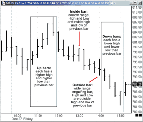
Up Bar is a bar with a higher high and higher low than the previous bar. The bars marked off are in an uptrend. Notice how the close is higher than the open until what turns out to be the last bar of the trend where the close is lower than the open. There were more sellers then buyers on the last bar.
Down Bar is a bar with a lower high and lower low than the previous bar. The bars marked off are in a downtrend. Notice how the close is lower than the open until what turns out to be the last bar of the trend where the close is higher than the open. There were more buyers then sellers on the last bar.
Inside Bar, also called a narrow range bar, is a bar with the high that is lower than the previous bar and low that is higher than the previous bar. Some traders do not consider an inside bar that has either an equal high or an equal low as an inside bar, others do. Inside bars usually represent market indecision. As on any bar, the closer the open and close are to each other shows just how undecided the market is as neither the buyers or sellers are in control. Buyers are in control on the inside bar marked on the chart because the close is at the top of the bar.
Outside Bar, also called a Wide Range or Engulfing Bar, is a bar with a high that is higher than the previous bar and with a low that is lower than the previous bar thereby engulfing the previous bar. Since the open and close are close together on the marked bar, neither the buyers or the sellers are in control and the market is undecided which way to go.
When the open is in the bottom quarter/third of the bar and the close is in the top quarter/third of the bar, it is said to be bullish engulfing with the buyers in control. When the open is in the top quarter/third of the bar and the close is in the bottom quarter/third, it is said to be bearish engulfing with the sellers in control.
Another definition used for this bar – especially if candlestick charts are used - is that the open and close have to engulf the previous bars open and close and not just the high and low of the bar. With this definition, the wide range bar or engulfing bar does not need to have a higher high or lower low to qualify. The first definition most probably came about with bar charts where it is harder to notice the open and close.
The following chart has the swing highs and lows marked in both an uptrend and a downtrend. Price on a given time frame is in an uptrend if it is making a higher highs (HH) and a high lows (HL) and in a downtrend if it is making lower highs (LH) and lower lows (LL). If price is doing anything else, it is in a consolidation pattern - range, triangle, pennant, rectangle etc.
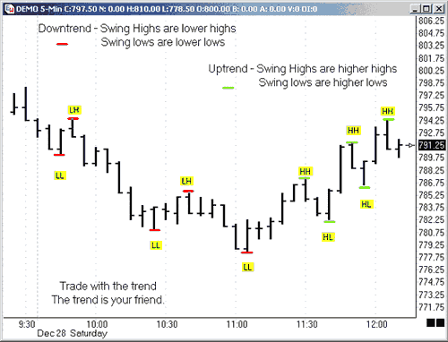
The trend is considered in place until price is no longer making higher highs and higher lows in an uptrend or lower highs and lower lows in a downtrend. After a trend is broken, there is usually a period of consolidation that is easier to see on a lower time frame.
With practice, you will be able to visualize this going on without looking at the lower time frame.
When price is in a consolidation pattern that is often referred to as chop, it is usually in a range with no trend pattern to the swing highs and lows.
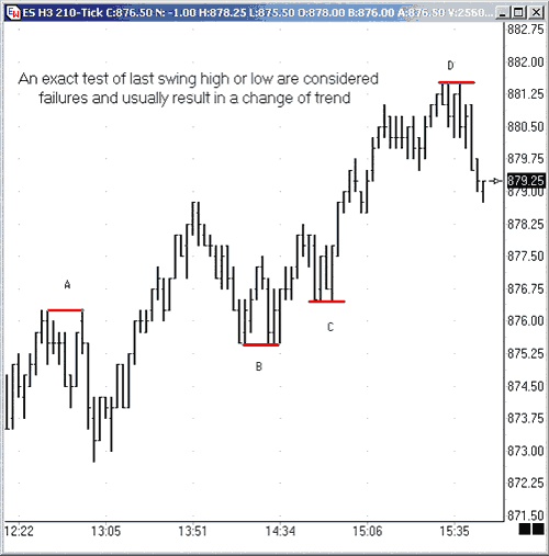
The above chart shows how an exact test of high or low may mean a change in trend as it failed to make a higher high on test of last swing high or a lower low on test of last swing low.
(A) Price was making HHs and HLs until price tested the prior swing high at A.
(B) Price made a LL and LH until price tested the prior swing low at B.
(C) Price made a LH (The bar that does not touch line at C) until price tested the prior swing low at C.
(D) Price was making HHs and HLs until price tested the prior swing high at D.
It is possible for one time frame to be in one trend and another time frame to be in a different trend or show consolidation. This is where the phrase “trend within a trend” regarding price action and the different time frames comes from. An example would be that while price may be rising on a daily chart, the intraday chart will show retracements, corrections of various types and consolidation periods
The true meaning of this and how it can influence your trading, eludes many. The following exercise is an excellent way to learn what the phrase “trend within trend” means visually
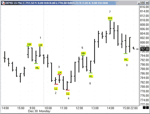
Pull up a 15 minutes chart and mark the highs as higher high (HH) or lower high (LH) and the lows as lower low (LL) or higher low (HL). (The note tool was used in Ensign to mark these charts.) You can also print out the chart and mark it by hand. Use red lines if price in a downtrend and green lines if price in an uptrend. Remember price is in an uptrend if it is making HH - and HL and in a downtrend if it is making LH and LL. If price is doing anything else, it can be a consolidation pattern - range, triangle, pennant, rectangle etc.
1-4 is in a downtrend.
5-8 is in an uptrend.
Now take the same chart and change the time frame to a 5 minutes chart, keeping the colored notes and numbers from the 15M by using the padlock with the L to lock lines in Ensign. Mark the new highs and lows with green numbers for an uptrend and red numbers for a downtrend.
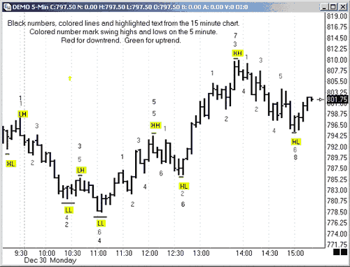
Now we can see by the yellow HH and LL what trend is on the 15M at the same time we are able to see the trend on the 5M
Both charts are in a downtrend until the 5M makes a HH at the first green #1. The downtrend is broken when the LH at black #3 is exceeded. Price then goes on to make a HL starting an uptrend that continues until price makes a lower high at the red #1. The 15M just made a HH at the black #5 and will not make a HL until black #6. At this point, we are expecting a HL on the 15M, and are waiting for a long signal on the 5M. Some traders would take the entry on the pair of reversal bars at red #2, others would wait until the last swing high at red #1 is exceeded.
The time frames are now in agreement (shown by green #1-#4) up to the black #7 HH. After the HH at #7, the 5M goes into a downtrend (shown by red #1-#6) to what is still a HL on the 15M at #8.
So, while the 15M price action shows only two trends, the 5M shows five different trends!
While you may trade the trends on the smaller time frame, waiting for price action to show it is going to move in the same direction as the larger time frame is trading with the trend.
The trend is your friend!
Article source Da Charts
TRADING BASED ON PRICE ACTION
Whenever someone is in the beginning process of learning forex, they usually fall in love with indicators. It's understandable that they would, because it definitely reduces the learning curve. But is it worth it?
Instead of just plugging indicators like MACD, Stochastics, Moving averages, etc... what if you left your charts completely alone? This is what forex trading using solely price action is all about.
Most people would be really hesitant to do that, just simply because they think that they don't know how you are supposed to trade without indicators? They are so used to having these tools that give you these signals when to open and close a trade.
There are a couple of problems with this.
For starters, these indicators are completely lagging. They are letting you know what has already happened. If you were to back test them, they would look amazing. They seem to catch every single move. BUT it's a completely different story when you are trading live.
I'm sure many of you forex veterans know what I am talking about. There are a lot of whipsaws. If you are not sure what these means, then I recommend you trade using only your indicators on a demo account, and then you'll know what I am talking about.
The other problem with just using indicators, is that you are not really the one who is trading. Your indicators are. You're just hoping that they are correct. So in essence, you are only as good of a trader as the indicators that you are using.
That's not the way it should be. In trading, especially technical trading, success requires some kind of analysis. It's your responsibility to fill in the blanks, not your indicators.
That's where price action comes in. If you can grasp the idea that a simple price chart has more information on it, then all of your indicators combined, you will be light years ahead of your fellow traders.
What is Price Action?
Price action is essentially the closest relative to order flow in Forex and across all markets. It is the direct result of order flow. Thus, it has the fingerprints of bias, speed of buying/selling, where buying and selling is occurring (support/resistance) when a breakout is genuine and where a likely reversal is occurring. From the continuous flow of price action which pours onto our charts, all indicators are born and thus dependent upon it. Hence, understanding and being able to interpret price action becomes an essential component to our trading. It is a way to get into the essence behind what creates the indicators and most technical signals in the markets.
The 4 Staples
Since there have been countless books, articles, etc. written on how to find and use support and resistance levels, lets dive into four unique methods or staples for understanding price action.
1) Impulsive vs Corrective
Although I dont promote the use of Eliot wave, Elliot Wave theory had the wisdom and insight to examine the difference between moves. The two essential moves everyone sees is either an Impulsive move or a Corrective move.
Impulsive Moves
An impulsive move is characterized by a forceful or strong move in one direction. It is quite fast and powerful, thus producing some of the larger candles in a set albeit any time frame. It is also usually followed by several candles moving in one direction, or the bulk of them in a move. The candles are often signified by closes towards the top or bottom of the candle, depending upon the direction of the impulsive move.
They are ultimately created by a large amount of capital with the buyers/sellers coming in at a particular level with a specific direction in mind. The other scenario is they are created due to a price cascade, via tripping up large stops and, thus, removing the defenses to the upside or downside of a support or resistance level, creating an imbalance to the order books. Impulsive moves can happen on any time frame.

Figure 1 illustrates a recent impulsive dive in the EUR/USD. In this 1 hr chart, notice how the move starts with the largest candle in the entire down move and the close being towards the bottom of the candle (signaling constant selling pressure for the entire hour).
EURUSD Impulsive Move Chart
Also notice how before, the move is a mix of red/blue candles, but once the impulsive move begins, we have six red candles in a row.
This move sends this pair on a capitulaiton lower from 1.5928 to 1.5756 (172 pips) in a matter of 6 hours. The daily ATR (average true range) for this pair was clocking in at 133 pips from top to bottom on a daily basis, but in 6 hours it moved more than the average daily range by almost 22%. This is a great example of an impulsive move.
These are the types of moves we want to be in. They are the moves where the order flow is most consistent and heavily biased in one direction. Its no secret the larger players move the market. Thus, being able to identify impulsive moves and riding such waves give us some of the best trading opportunities.
Congested Corrective Moves
Corrective moves are the most common moves to follow an impulsive move. They are practically the inverse of impulsive moves. The candle bodies are usually smaller in nature with closes not particularly aligned to the top or bottom. They are usually a mixed bag of fruit with both up and down candles and generally have little or no bias. It is important to identify these because they are the prelude to the next impulsive move.
From an order flow perspective, they are usually created by one of two scenarios: 1) profit taking after an impulsive move with few significant buyers/sellers coming in to challenge the previous move, or 2) a clear mix of buyers and sellers residing at the same place and a potential reversal point. More often than not, a corrective move following an impulsive move is usually a continuation move.


In Figure 2 we are looking at the same EUR/USD move which displays the corrective move before the large triple landing dive for this pair, followed by another corrective move and then further selling.
EURUSD Corrective Move Chart
Remember, when trading, we want the order flow bias to be heavily in our favor. Corrective moves offer little bias with order books closely aligned to 50% buyers and sellers. Even in the better case scenarios with a 60/40 tilt, you still have a much higher percentage of players on the other side of the market, moving the price action in the opposite direction of your trade. Ideally, we want the highest tilt available and corrective moves in and of themselves do not offer this for us as forex traders.
The next two forex methods are interesting
2) Pips Gained vs. Pips Lost
Looking at figure 3, we can see the NZDJPY pair was on a heavy decline from just above 85.00, falling all the way down to 68.00. The pair had bounced off the lows 400 pips to challenge the 72 figure. After a little dip, the pair re-attacked the 72 level and looked to break to the upside. There was also the presence of a small Inverted Head and Shoulders pattern which is a clear reversal pattern.
NZDJOY Pips Gain VS Lost Chart

In front of all this, I would stil feel bearish. Regardless of the top from this down move (87.05), the pair had started the year at 80.48 with the current price being 72.15 on the close of the then current day. The pair had ultimately lost 833 pips on the year. The price action had suggested for the bulk of the year, traders were much more apt to be selling instead of buying. Furthermore, using our impulsive vs. corrective analysis, the most impulsive moves for the six months of price action were clearly to the downside, with the series of moves having more consistency in the sell-offs vs. the buy-ups.
Given the chart, you would umtimatley be favoring selling this forex pair. The pair then further declined 340 pips over the next two weeks. Being long the pair at that time was clearly not the option.
Thus, we can see how measuring pips gained vs. lost gives an insight into where the previous buying and selling had occurred and where the next likely move is. Another stellar example of this is the USD/CAD.
In the late summer of 2007, the USD/CAD (figure 4) had started to show some bottoming after a torrential sell-off. After some consolidation, the pair sold off from 1.1800 to 1.0400 in a period of 4 months. This was a merciless move that could find nobody willing to step in front of the locomotive selling. The pair finally found a decent floor after bouncing off the 1.0400 handle and settled between 1.0500 and 1.0700. At this time, hundreds of technicians and economists, still baffled by the overextended downtrend and momentum of this move, were calling for a reversal, at least in the short term. Now consider some very important questions using the pips gained vs. lost method.

USDCAD Pips Gain VS Lost Chart
The pair sold off roughly 1400 pips in 4 months and was down about 1100 for the year. On top of that, it was only 4.5 years ago the pair was at 1.6000 (5500 pips ago) and had yet to complete anything greater than a 50% retracement of any major leg, with each retracement going to its corresponding extension. In light of all that, why in the world would anyone be paying attention to indicators and their over-extension since the pair had no regard for them? Furthermore, who in the last 4 years made significant money buying the USD/CAD? And since the order books/price action were completely dominated by an overwhelming pips lost vs. pips gained, who could even think about buying or a reversal until we have a clear bottom, albeit an activated reversal pattern or a 61.8% fib break of any major leg? The answer was obvious – keep selling until proven otherwise since that is where the price action had reigned king and had yet to be dethroned.
Measuring pips gained vs. pips lost gives us a pure look at where the order flow is most consistent leading up to the current day/time. This method is very powerful over longer time frames, but is incredibly helpful on shorter intraday times as well. Be wary of trading in front of serious moves where the pips gained vs. lost is against you.
3) Counting Candles

Counting candles in a series or leg of a move can be useful on many fronts. First, it can tell you how many weeks/days/hours/minutes a pair has been bought up or sold off. If you are looking at an entire year, this can be very helpful in identifying where the clear buying/selling pressure is likely to continue. Even on intraday moves, this has potency. It also gives you a rough idea for a particular leg, what the percentage is you will make money on that candle, or lose money.
A look at figure 5 ushers some insight into this. Looking at our NZD/JPY daily chart, while heading into this trade, for the year the pair had 59 red candles and 52 blue candles. That meant on any given day up till that point in 2006, there was about a 50% chance of making money if you entered and exited the position on the beginning and ending of each day. However, using the pips gained vs. lost method, the 50% became much more heavily weighted to the downside suggesting if you sold on any day and were correct, you would make more money. The counting candles gave us an initial % value to the likelihood of our trade being successful, but combined with another method, increased the value of our short position significantly.
NZDJPY Counting Candles Chart
4) Time Variables
Pattern recognition and Elliot wave methods do a solid job of bringing in time variables into trading, but they leave many details into question. Two methods to working with time variables are listed below.
a) Time lapse/display for patterns
When looking at a pattern, albeit Head and Shoulders or IHS, wedges/triangles, or even consolidations, it is important to examine the time lapse/display involved and how it should play itself out.
The GBP/JPY from late 06’ to the beginning of 08’ was forming a large Head and Shoulders pattern. This was heavily watched by technicians as the break was suggestive to be massive with the distance between the head and neckline roughly 2900 pips. What was more interesting was the time displayed in the formation of the pattern.
Looking at figure 6, notice the vertical lines which identify the touchdowns where the beginning and ending of each shoulder was made. The left shoulder from initial floor around 221.41, to its rise and fall back down to the same level took about 4 months and 3 weeks. What was tough for traders to figure out was when the right shoulder was forming, particularly if the second touchdown on 221.41 in late November was going to be the last stand at the OK Corral. Notice how the pair bounced just a bit, and then re-attacked the same price level to easily break it the 2nd time around. When the RS was forming, the space or time displayed between the 1st/2nd touchdown was only about 3 months, yet the initial LS took 4 months and 3 weeks suggesting the RS should take about the same amount of time to form.
GBPJPY Time Lapse Chart

If you look at when the pair finally activated the break of the neckline, the time lapse or display was 4 months, and 2.3 weeks. This is very common amongst patterns - to have a consistent time lapse or display within themselves. Some other notables are wedges and triangles which usually complete or exit their patterns between 2/3rds and 3/4ths of the move. Rarely ever do they go to completion.
b) Length of consolidation
One other important time variable is how long a consolidation is forming. The larger the consolidation, the greater the probability the ensuing breakout will be legitimate and powerful. Breakouts are such a mystery to so many traders. Measuring the length of the consolidation can provide us powerful insights into this trading conundrum.
Taking a look at the EUR/USD in figure 7, on July 10th, 2008 the pair had opened the European session at 1.5724, dipped to the round number at 1.5700 and then come early NY session was bought up in solid fashion up to the 1.5800 handle. This 100 pip move occurred over 3 hours, where it not surprisingly tapered back a bit at the London close. The pair then consolidated from 9am PST within a 36 pip range for the next 18 hours.

While it is not surprising there was no breakout during the Asian session, what is interesting is that from Noon – 4pm EST, where there is still plenty of liquidity, the pair could not find any new buyers/sellers. For the next 13 hours, the pair still trotted in place not just through the Asian order books, but also through the first four hours of the European session. That means through three sets of different order books/interest, the pair was hemmed in a 36 pip range and nobody could alter this for a total of 18 hours. When you see a consolidation for that long a period of time, expect a significant breakout to occur.
The following breakout gave us a nice retest of the previous resistance level and then generated a 160 pip move in roughly 4 hours. This was the largest single day climb of the week and ironically followed the longest consolidation of that week.
One last example of this method can be delivered via the EUR/CAD (figure 8). In the fall of 2006, this pair had entered a really tight consolidation between the end of August to the beginning of November, encroached between 1.4060 - 1.4350 (290 pip range). This was the tightest 60 day plus range over the last 4 years. With the Bollinger Bands applying their python like constriction, a large breakout was calling out to most traders. When the pair finally did breakout, it gave us a handsome retest of the previous 70day resistance level, and then went on a Himalayan trek for a 1000 pip climb in only one month. Being able to identify long consolidations can point us towards legitimate and powerful breakouts.

In Summary
Although there are many great methods for gleaning solid information out of price action (candlesticks, Elliot wave, pattern recognition), it is important we reach deeper into one of the most unexplored areas of technical analysis – that of understanding and interpreting price action. Being the closest relative to order flow and the mother of all technical indicators, a continual and intensive study of price action can only provide us with some of the most important gems of information to support our trading decisions.
The 4 staples or methods listed above are designed to give the traders a unique set of tools for approaching their charts and building a recipe for solid trades. Through the lens of these and other methods, ones trading can be vaulted to another level of insight, ability and success in trading the Forex market. More in depth information on price action and real world trading examples can be found throughout this website.
Instead of just plugging indicators like MACD, Stochastics, Moving averages, etc... what if you left your charts completely alone? This is what forex trading using solely price action is all about.
Most people would be really hesitant to do that, just simply because they think that they don't know how you are supposed to trade without indicators? They are so used to having these tools that give you these signals when to open and close a trade.
There are a couple of problems with this.
For starters, these indicators are completely lagging. They are letting you know what has already happened. If you were to back test them, they would look amazing. They seem to catch every single move. BUT it's a completely different story when you are trading live.
I'm sure many of you forex veterans know what I am talking about. There are a lot of whipsaws. If you are not sure what these means, then I recommend you trade using only your indicators on a demo account, and then you'll know what I am talking about.
The other problem with just using indicators, is that you are not really the one who is trading. Your indicators are. You're just hoping that they are correct. So in essence, you are only as good of a trader as the indicators that you are using.
That's not the way it should be. In trading, especially technical trading, success requires some kind of analysis. It's your responsibility to fill in the blanks, not your indicators.
That's where price action comes in. If you can grasp the idea that a simple price chart has more information on it, then all of your indicators combined, you will be light years ahead of your fellow traders.
What is Price Action?
Price action is essentially the closest relative to order flow in Forex and across all markets. It is the direct result of order flow. Thus, it has the fingerprints of bias, speed of buying/selling, where buying and selling is occurring (support/resistance) when a breakout is genuine and where a likely reversal is occurring. From the continuous flow of price action which pours onto our charts, all indicators are born and thus dependent upon it. Hence, understanding and being able to interpret price action becomes an essential component to our trading. It is a way to get into the essence behind what creates the indicators and most technical signals in the markets.
The 4 Staples
Since there have been countless books, articles, etc. written on how to find and use support and resistance levels, lets dive into four unique methods or staples for understanding price action.
1) Impulsive vs Corrective
Although I dont promote the use of Eliot wave, Elliot Wave theory had the wisdom and insight to examine the difference between moves. The two essential moves everyone sees is either an Impulsive move or a Corrective move.
Impulsive Moves
An impulsive move is characterized by a forceful or strong move in one direction. It is quite fast and powerful, thus producing some of the larger candles in a set albeit any time frame. It is also usually followed by several candles moving in one direction, or the bulk of them in a move. The candles are often signified by closes towards the top or bottom of the candle, depending upon the direction of the impulsive move.
They are ultimately created by a large amount of capital with the buyers/sellers coming in at a particular level with a specific direction in mind. The other scenario is they are created due to a price cascade, via tripping up large stops and, thus, removing the defenses to the upside or downside of a support or resistance level, creating an imbalance to the order books. Impulsive moves can happen on any time frame.

Figure 1 illustrates a recent impulsive dive in the EUR/USD. In this 1 hr chart, notice how the move starts with the largest candle in the entire down move and the close being towards the bottom of the candle (signaling constant selling pressure for the entire hour).
EURUSD Impulsive Move Chart
Also notice how before, the move is a mix of red/blue candles, but once the impulsive move begins, we have six red candles in a row.
This move sends this pair on a capitulaiton lower from 1.5928 to 1.5756 (172 pips) in a matter of 6 hours. The daily ATR (average true range) for this pair was clocking in at 133 pips from top to bottom on a daily basis, but in 6 hours it moved more than the average daily range by almost 22%. This is a great example of an impulsive move.
These are the types of moves we want to be in. They are the moves where the order flow is most consistent and heavily biased in one direction. Its no secret the larger players move the market. Thus, being able to identify impulsive moves and riding such waves give us some of the best trading opportunities.
Congested Corrective Moves
Corrective moves are the most common moves to follow an impulsive move. They are practically the inverse of impulsive moves. The candle bodies are usually smaller in nature with closes not particularly aligned to the top or bottom. They are usually a mixed bag of fruit with both up and down candles and generally have little or no bias. It is important to identify these because they are the prelude to the next impulsive move.
From an order flow perspective, they are usually created by one of two scenarios: 1) profit taking after an impulsive move with few significant buyers/sellers coming in to challenge the previous move, or 2) a clear mix of buyers and sellers residing at the same place and a potential reversal point. More often than not, a corrective move following an impulsive move is usually a continuation move.

In Figure 2 we are looking at the same EUR/USD move which displays the corrective move before the large triple landing dive for this pair, followed by another corrective move and then further selling.
EURUSD Corrective Move Chart
Remember, when trading, we want the order flow bias to be heavily in our favor. Corrective moves offer little bias with order books closely aligned to 50% buyers and sellers. Even in the better case scenarios with a 60/40 tilt, you still have a much higher percentage of players on the other side of the market, moving the price action in the opposite direction of your trade. Ideally, we want the highest tilt available and corrective moves in and of themselves do not offer this for us as forex traders.
The next two forex methods are interesting
2) Pips Gained vs. Pips Lost
Looking at figure 3, we can see the NZDJPY pair was on a heavy decline from just above 85.00, falling all the way down to 68.00. The pair had bounced off the lows 400 pips to challenge the 72 figure. After a little dip, the pair re-attacked the 72 level and looked to break to the upside. There was also the presence of a small Inverted Head and Shoulders pattern which is a clear reversal pattern.
NZDJOY Pips Gain VS Lost Chart

In front of all this, I would stil feel bearish. Regardless of the top from this down move (87.05), the pair had started the year at 80.48 with the current price being 72.15 on the close of the then current day. The pair had ultimately lost 833 pips on the year. The price action had suggested for the bulk of the year, traders were much more apt to be selling instead of buying. Furthermore, using our impulsive vs. corrective analysis, the most impulsive moves for the six months of price action were clearly to the downside, with the series of moves having more consistency in the sell-offs vs. the buy-ups.
Given the chart, you would umtimatley be favoring selling this forex pair. The pair then further declined 340 pips over the next two weeks. Being long the pair at that time was clearly not the option.
Thus, we can see how measuring pips gained vs. lost gives an insight into where the previous buying and selling had occurred and where the next likely move is. Another stellar example of this is the USD/CAD.
In the late summer of 2007, the USD/CAD (figure 4) had started to show some bottoming after a torrential sell-off. After some consolidation, the pair sold off from 1.1800 to 1.0400 in a period of 4 months. This was a merciless move that could find nobody willing to step in front of the locomotive selling. The pair finally found a decent floor after bouncing off the 1.0400 handle and settled between 1.0500 and 1.0700. At this time, hundreds of technicians and economists, still baffled by the overextended downtrend and momentum of this move, were calling for a reversal, at least in the short term. Now consider some very important questions using the pips gained vs. lost method.

USDCAD Pips Gain VS Lost Chart
The pair sold off roughly 1400 pips in 4 months and was down about 1100 for the year. On top of that, it was only 4.5 years ago the pair was at 1.6000 (5500 pips ago) and had yet to complete anything greater than a 50% retracement of any major leg, with each retracement going to its corresponding extension. In light of all that, why in the world would anyone be paying attention to indicators and their over-extension since the pair had no regard for them? Furthermore, who in the last 4 years made significant money buying the USD/CAD? And since the order books/price action were completely dominated by an overwhelming pips lost vs. pips gained, who could even think about buying or a reversal until we have a clear bottom, albeit an activated reversal pattern or a 61.8% fib break of any major leg? The answer was obvious – keep selling until proven otherwise since that is where the price action had reigned king and had yet to be dethroned.
Measuring pips gained vs. pips lost gives us a pure look at where the order flow is most consistent leading up to the current day/time. This method is very powerful over longer time frames, but is incredibly helpful on shorter intraday times as well. Be wary of trading in front of serious moves where the pips gained vs. lost is against you.
3) Counting Candles

Counting candles in a series or leg of a move can be useful on many fronts. First, it can tell you how many weeks/days/hours/minutes a pair has been bought up or sold off. If you are looking at an entire year, this can be very helpful in identifying where the clear buying/selling pressure is likely to continue. Even on intraday moves, this has potency. It also gives you a rough idea for a particular leg, what the percentage is you will make money on that candle, or lose money.
A look at figure 5 ushers some insight into this. Looking at our NZD/JPY daily chart, while heading into this trade, for the year the pair had 59 red candles and 52 blue candles. That meant on any given day up till that point in 2006, there was about a 50% chance of making money if you entered and exited the position on the beginning and ending of each day. However, using the pips gained vs. lost method, the 50% became much more heavily weighted to the downside suggesting if you sold on any day and were correct, you would make more money. The counting candles gave us an initial % value to the likelihood of our trade being successful, but combined with another method, increased the value of our short position significantly.
NZDJPY Counting Candles Chart
4) Time Variables
Pattern recognition and Elliot wave methods do a solid job of bringing in time variables into trading, but they leave many details into question. Two methods to working with time variables are listed below.
a) Time lapse/display for patterns
When looking at a pattern, albeit Head and Shoulders or IHS, wedges/triangles, or even consolidations, it is important to examine the time lapse/display involved and how it should play itself out.
The GBP/JPY from late 06’ to the beginning of 08’ was forming a large Head and Shoulders pattern. This was heavily watched by technicians as the break was suggestive to be massive with the distance between the head and neckline roughly 2900 pips. What was more interesting was the time displayed in the formation of the pattern.
Looking at figure 6, notice the vertical lines which identify the touchdowns where the beginning and ending of each shoulder was made. The left shoulder from initial floor around 221.41, to its rise and fall back down to the same level took about 4 months and 3 weeks. What was tough for traders to figure out was when the right shoulder was forming, particularly if the second touchdown on 221.41 in late November was going to be the last stand at the OK Corral. Notice how the pair bounced just a bit, and then re-attacked the same price level to easily break it the 2nd time around. When the RS was forming, the space or time displayed between the 1st/2nd touchdown was only about 3 months, yet the initial LS took 4 months and 3 weeks suggesting the RS should take about the same amount of time to form.
GBPJPY Time Lapse Chart

If you look at when the pair finally activated the break of the neckline, the time lapse or display was 4 months, and 2.3 weeks. This is very common amongst patterns - to have a consistent time lapse or display within themselves. Some other notables are wedges and triangles which usually complete or exit their patterns between 2/3rds and 3/4ths of the move. Rarely ever do they go to completion.
b) Length of consolidation
One other important time variable is how long a consolidation is forming. The larger the consolidation, the greater the probability the ensuing breakout will be legitimate and powerful. Breakouts are such a mystery to so many traders. Measuring the length of the consolidation can provide us powerful insights into this trading conundrum.
Taking a look at the EUR/USD in figure 7, on July 10th, 2008 the pair had opened the European session at 1.5724, dipped to the round number at 1.5700 and then come early NY session was bought up in solid fashion up to the 1.5800 handle. This 100 pip move occurred over 3 hours, where it not surprisingly tapered back a bit at the London close. The pair then consolidated from 9am PST within a 36 pip range for the next 18 hours.

While it is not surprising there was no breakout during the Asian session, what is interesting is that from Noon – 4pm EST, where there is still plenty of liquidity, the pair could not find any new buyers/sellers. For the next 13 hours, the pair still trotted in place not just through the Asian order books, but also through the first four hours of the European session. That means through three sets of different order books/interest, the pair was hemmed in a 36 pip range and nobody could alter this for a total of 18 hours. When you see a consolidation for that long a period of time, expect a significant breakout to occur.
The following breakout gave us a nice retest of the previous resistance level and then generated a 160 pip move in roughly 4 hours. This was the largest single day climb of the week and ironically followed the longest consolidation of that week.
One last example of this method can be delivered via the EUR/CAD (figure 8). In the fall of 2006, this pair had entered a really tight consolidation between the end of August to the beginning of November, encroached between 1.4060 - 1.4350 (290 pip range). This was the tightest 60 day plus range over the last 4 years. With the Bollinger Bands applying their python like constriction, a large breakout was calling out to most traders. When the pair finally did breakout, it gave us a handsome retest of the previous 70day resistance level, and then went on a Himalayan trek for a 1000 pip climb in only one month. Being able to identify long consolidations can point us towards legitimate and powerful breakouts.

In Summary
Although there are many great methods for gleaning solid information out of price action (candlesticks, Elliot wave, pattern recognition), it is important we reach deeper into one of the most unexplored areas of technical analysis – that of understanding and interpreting price action. Being the closest relative to order flow and the mother of all technical indicators, a continual and intensive study of price action can only provide us with some of the most important gems of information to support our trading decisions.
The 4 staples or methods listed above are designed to give the traders a unique set of tools for approaching their charts and building a recipe for solid trades. Through the lens of these and other methods, ones trading can be vaulted to another level of insight, ability and success in trading the Forex market. More in depth information on price action and real world trading examples can be found throughout this website.
Subscribe to:
Comments (Atom)